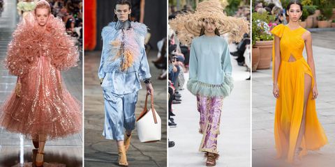
If you've ever watched The Devil Wears Prada, you know from the infamous Blue Sweater scene how fashion trends influence textiles, touching every part of the event industry. By taking a hard look at fashion week each year, we can forecast upcoming fashion trends in events. And this year, it looks like ruffles and feathers took center stage.
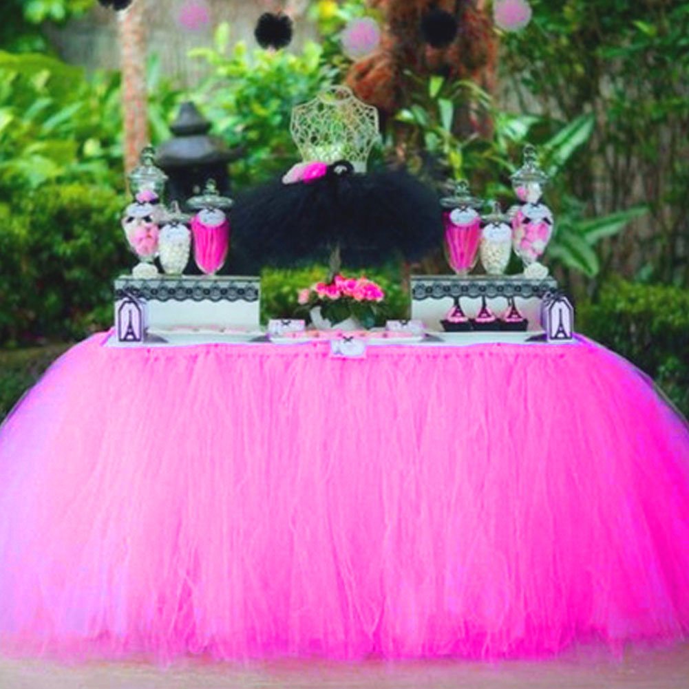
"How do I incorporate these looks into my events without turning my cake table into a chicken?" you may ask. Here are some Ideas to use the artistry of Fashion Week without turning your wedding cake into grandma's bedspread.
1. Don't take Fashion Week so seriously.
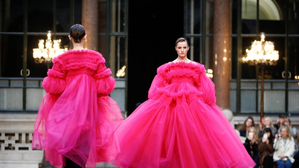
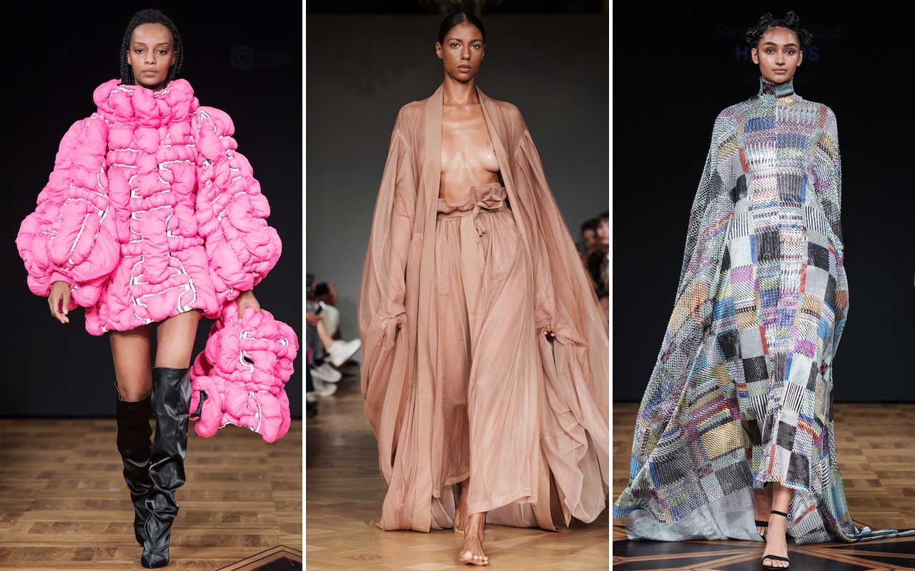
You're not likely to EVER find this dress on the rack at Macy's. These designers don't actually mean for their dresses to be worn by anyone. They are art statements only. Trust me. I'm sure this designer is brilliant, but from the front, this poor model looks like she's being swallowed alive and from the back she looks like she accidentally tucked the back of her skirt in with her top. Use Fashion Week to inspire your own creativity.
2. Fashion Week is LOUD. Turn down the volume.
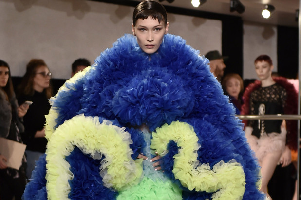

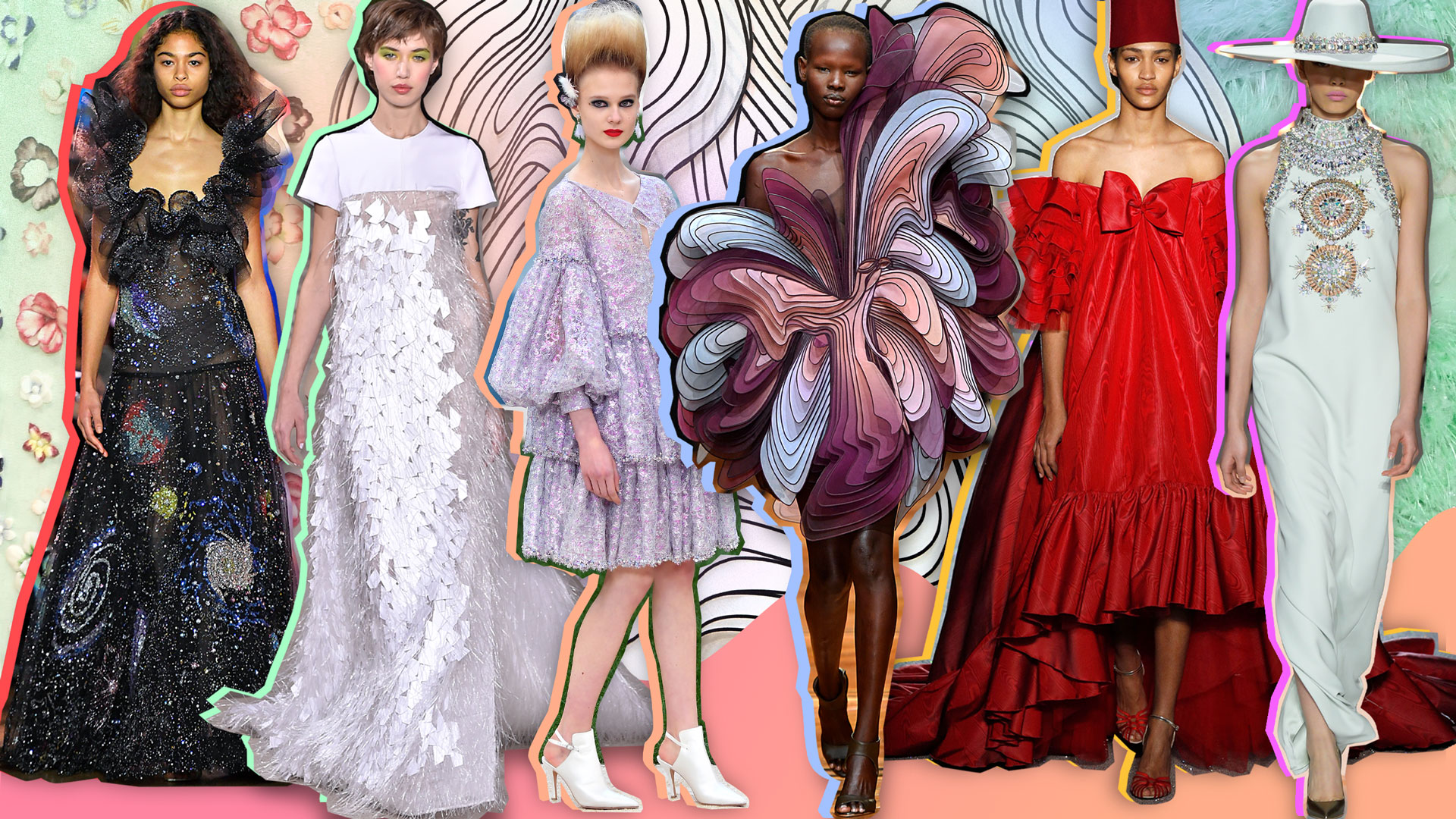
Ok, so I might have included these particular pics because one model looks like she skinned Cookie Monster, one looks like chewed bubble gum, one forgot her top, and the last looks like she cut a hole in the middle of your little brother's old bed spread. I was literally like OMG ROFL. The actual takeaway from this visual is to take risks. Don't kill a Sesame Street character or anything, but don't be afraid to mix media in your centerpieces and bouquets. The bouquet photo I've chosen here is a gorgeous mix of florals, feathers, and purple cabbage leaves, which blend beautifully with the bride's metallic gold dress.
3. The Judicious Use of Ruffles and Feathers
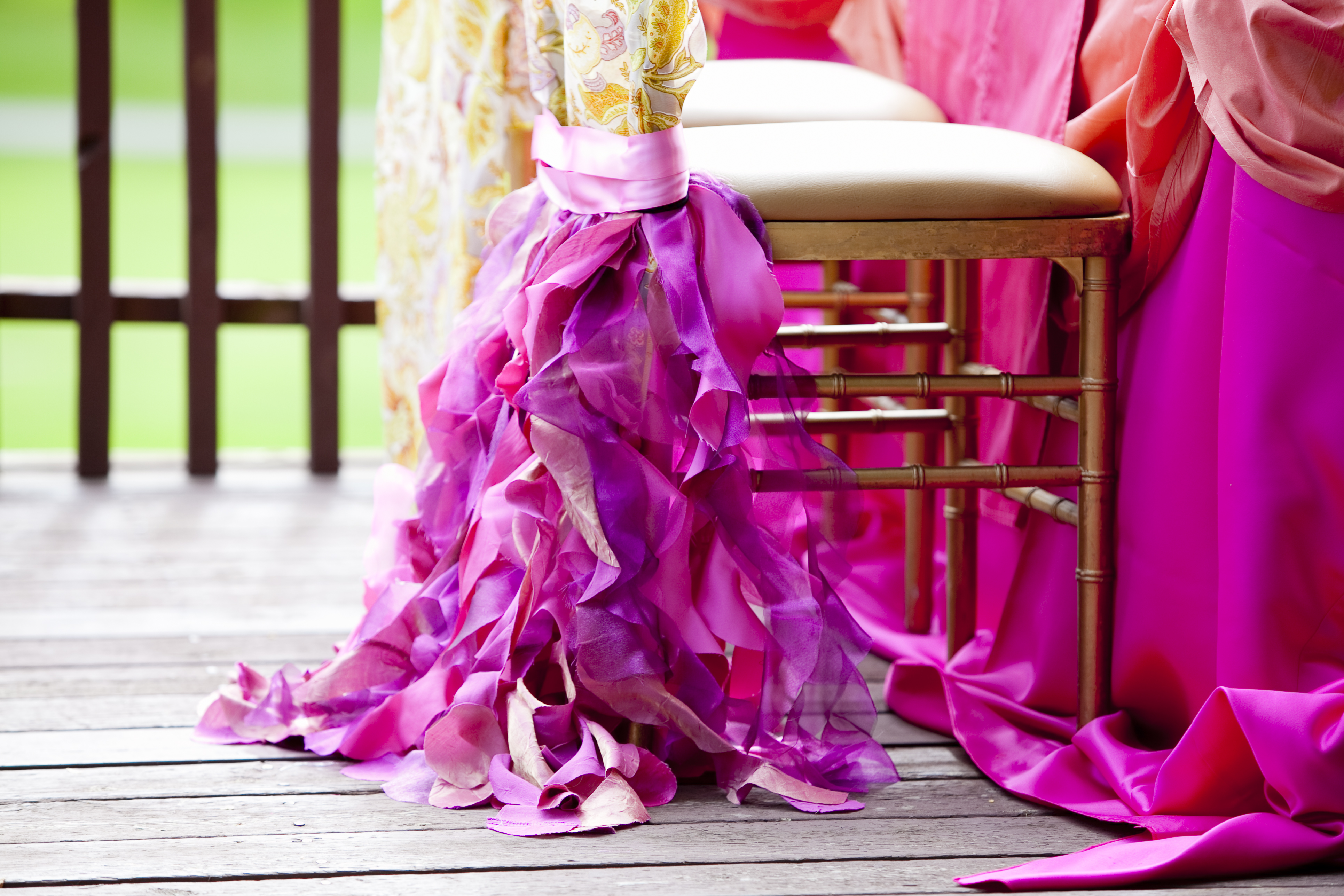
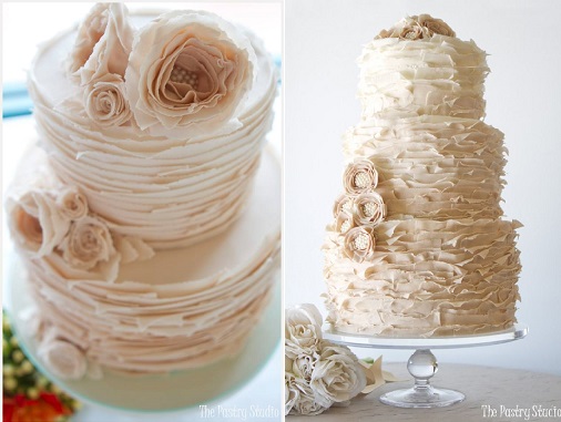

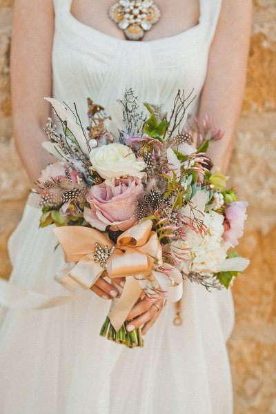
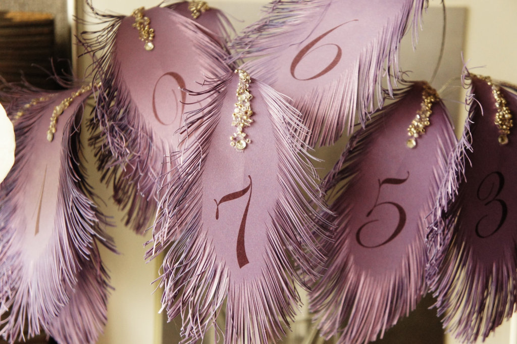
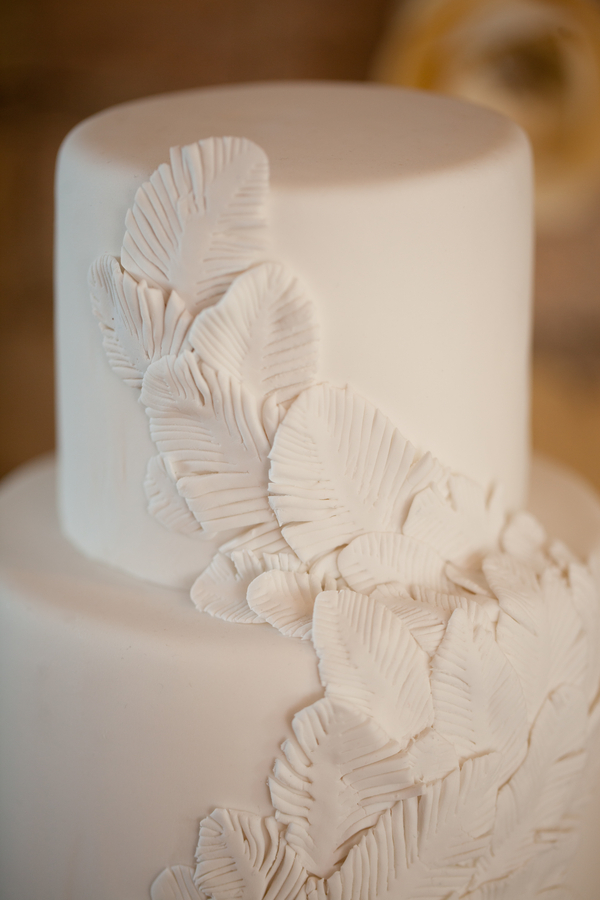
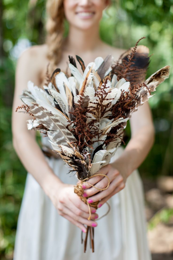
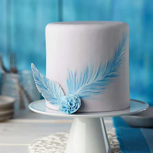
So, if ruffles and feathers are in our future, how do we incorporate them into our event designs without going too far? Take inspiration from the artistry and flash of Fashion Week and just add touches, be they bold or subtle to your decor scheme.
4. Pantone's Color of the Year
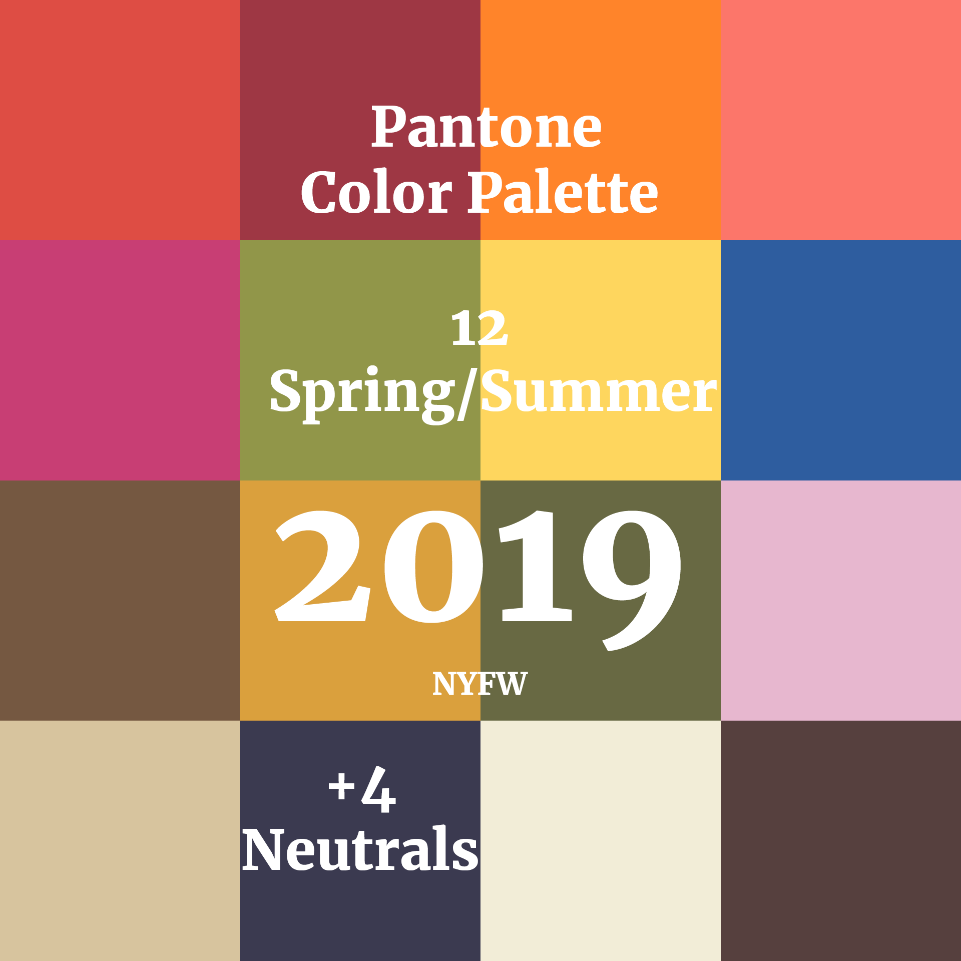
This post would not be complete without Pantone's Color of the Year: Living Coral (upper right-hand corner). It might be worth mentioning that this palette bears an almost striking resemblance to the Pantone Spring/Summer palette of 2017. Pantone said of it's 2019 choice: "We wanted a color that would mirror the president's fake bake." Just kidding. They actually said, "Representing the fusion of modern life, PANTONE Living Coral is a nurturing color that appears in our natural surroundings and at the same time, displays a lively presence within social media." So, you know, same dif.